Final Product

My final poster for the ancillary text was created using Adobe Photoshop as the software. I intended to create something which used images from the front cover and digi-pak yet giving a sense of mystery to those who would be purchasing the album. This is because the band Radiohead often display themselves as mysterious people both in their artwork and lyricism. Because of this, I excluded the title and artist name from the initial front cover which is displayed on the poster so that the artwork was more outstanding. The band name and title are shown above and below the artwork so that it is more clear to the audience of what the poster is advertising.
I chose the font for the title/subtitles 'Radiohead' and 'Exit Music (For a Film)' by investigating the works of other artists of a similar genre. I came to the conclusion that this was an appropriate font as it does not look too modern which maintains the vintage appearance which I have tried to convey throughout the ancillary texts. The use of italics on the lettering makes the titles appear to be somewhat outstanding as it is the only area of text on the page which uses it. Beneath the titles and subheaders, the lines which read 'New EP Out In Stores Junes 21st' and the reviews from other magazines use a conventional font style as it is easiest to read for the audience. The traditional type of font also connotes the vintage appearance.
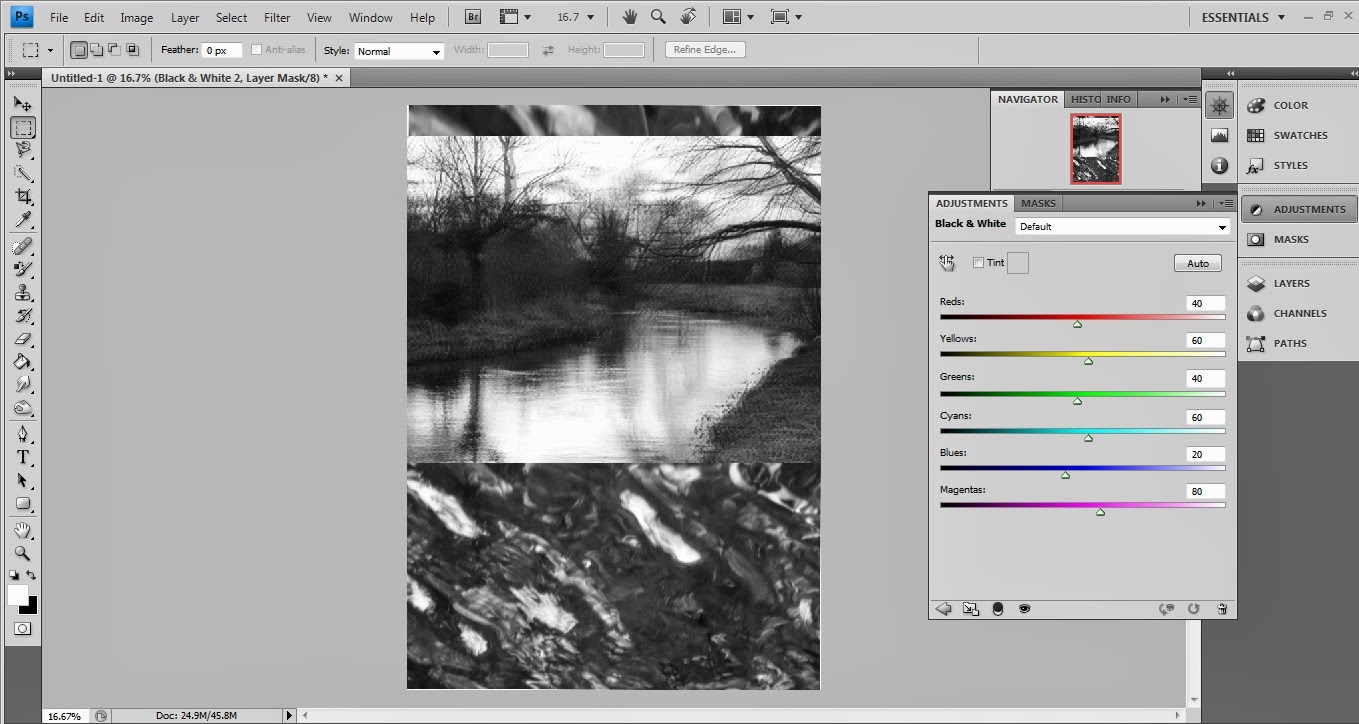
When I was researching other posters, I found that it was appropriate to use a background which either contrasts with the artwork or is a larger version of the artwork itself. As the artwork is rather abstract, I believed that it would not be appropriate for an enlargement to dictate the entire poster. Therefore, I used an image which I had taken myself of water to contrast against the artwork whilst using the same kind of theme. When I was first editing this, I thought of making the entire poster in grayscale so that it had a strong vintage appearance to it. I also had made the artwork cover the majority of the top half of the page. Once I had gotten further with this idea (shown above), I decided that it was too bland to feature in magazines and newspapers; this meant that I had to make the artwork in colour to contrast against the grayscale background. Additionally, I had shrunk the artwork so that the background was also a bold feature.
Whilst editing the poster on Adobe Photoshop, I realised that the contrasting of colour and grayscale was essential to make the advertisement stand out; in addition to this, I altered the levels so that the colours went together. I used tools such as colour adjustments and contrasting to make the background appear darker yet not too dark so that the waves in the water were still noticeable. I believe that this adds to the dreamy feel that the audience receives from the image as a whole. Finally, I added the reviews from exterior magazines, these were determined through my knowledge of which magazines often review the alternative rock genre of music. The positive reviews were essential as many people rely on these companies to recommend them music accustom to their music taste, if the right review sites claim that an album is good, it is likely that it will increase sales. The record label logo was pasted in the bottom corner so that there was a sense of recognition, normally labels insist that their logo is included on the bands work. Finally, the logos of Twitter and Facebook were added so that the audience can find the album on social networking sites as another form of promotion. In the bottom left corner it reads '#ExitMusic', this is so that people can use this hashtag on twitter to find information about the release and also promote it by making it trend on the site.
No comments:
Post a Comment